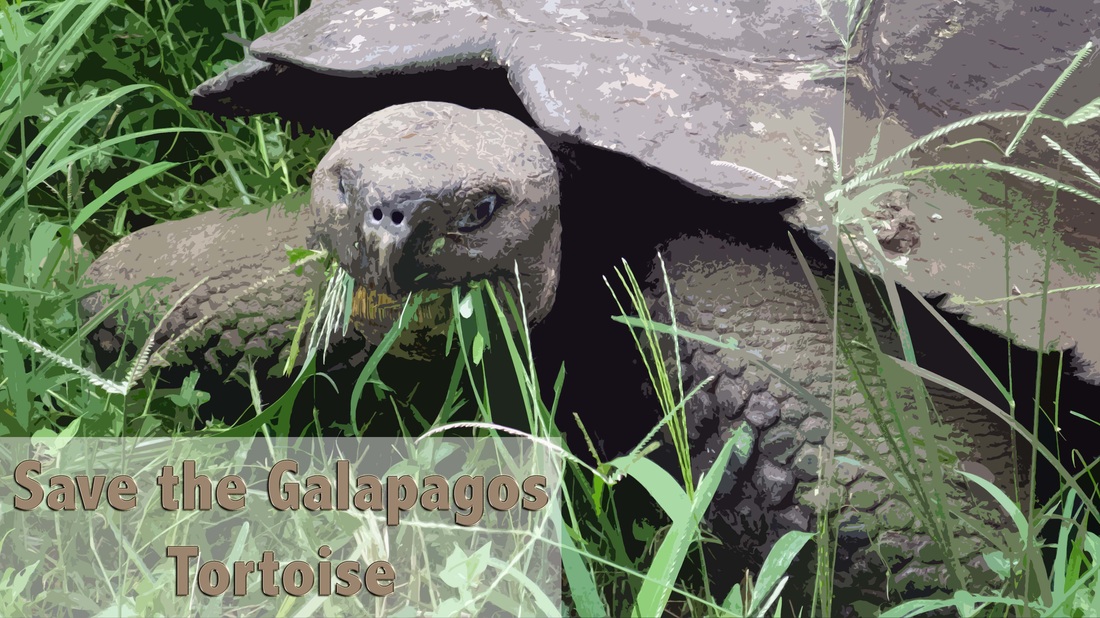
Design Principles
- Color- I made the tones in this image much more vibrant
- Contrast- I made the colors have greater contrast in order to add to the vintage postcard effect
- Filter- I used the Cutout filter to achieve this look
- Layer Effects- I added a drop shadow and embossed look to make the text stand out more
